
Augusta University
Digital Web Experience Transformation
Years: 2018-2019



DILEMMA
Prospective and current graduate students were navigating a fragmented web experience — inconsistent information architecture, outdated content, and no systematic way to know where the journey was breaking down. Leadership had a growth mandate: increase enrollment across the Graduate School's 49 programs.
OBJECTIVE
Rebuild the graduate enrollment experience as a full service, not a single site relaunch — and build a continuous, evidence-based process for improving it, so gains would compound rather than reset after launch.
MY ROLE Information Architect | Content Strategist | Web & Behavioral Analyst | Project/Product Manager
CAPABILITIES LEVERAGED Cohesive Digital Identity & Enrollment Strategy (Web Analytics, Digital Content Creation, UX Design, Information Architecture, Storyboarding)
PROCESS
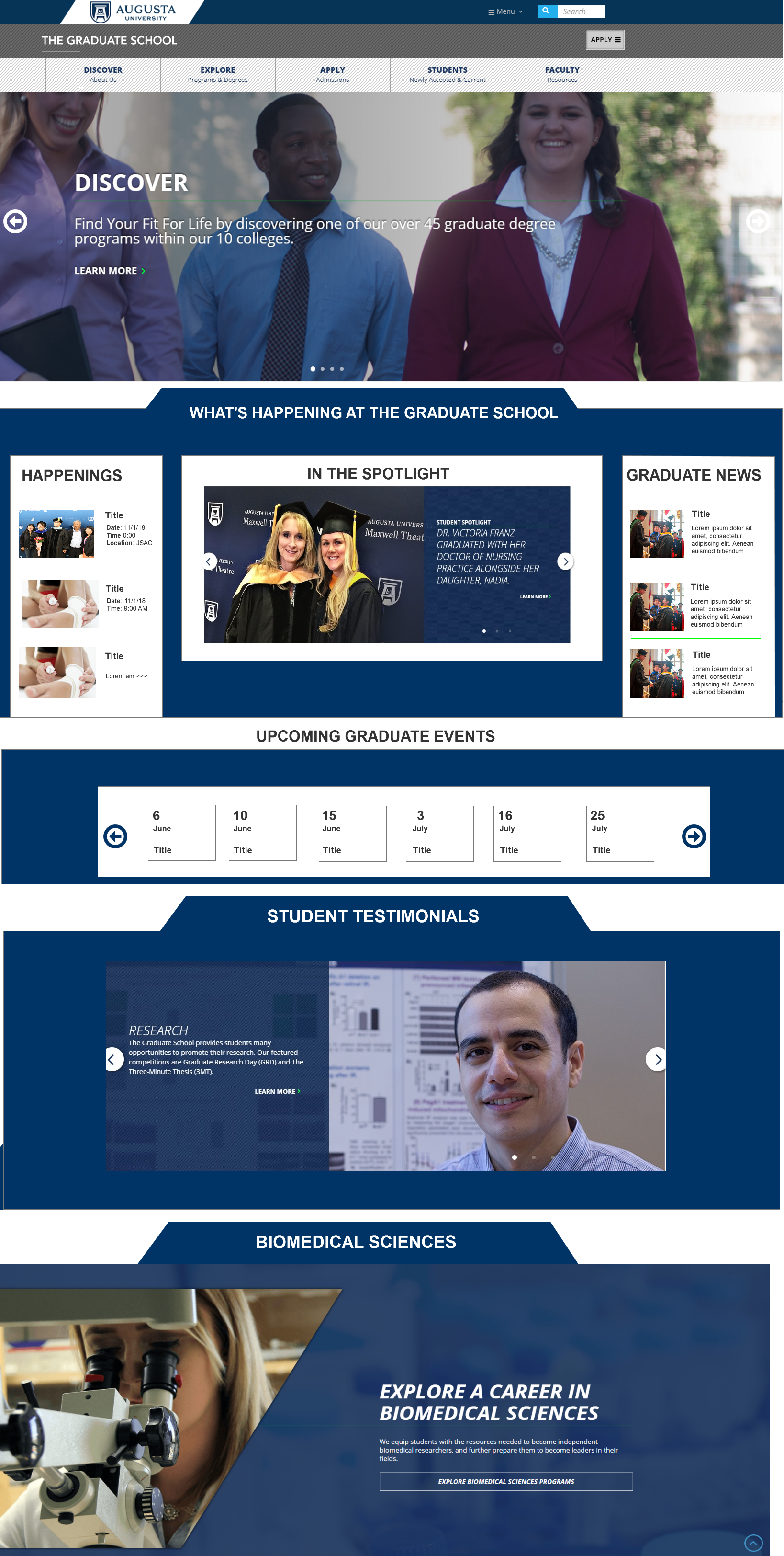
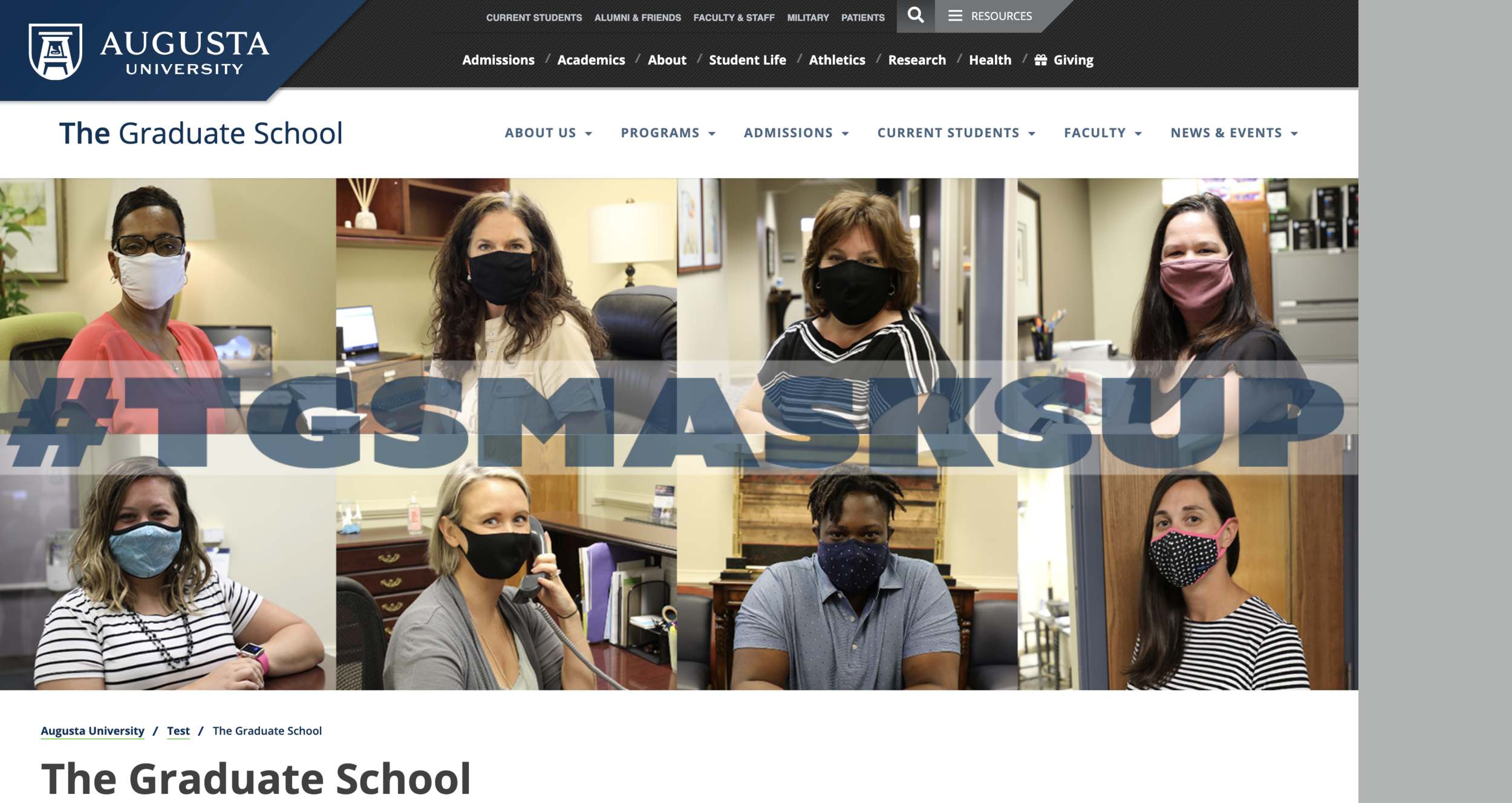
The redesign started with the structural problem: a content inventory across every page to identify what to consolidate, cut, or fill in, followed by an information architecture built with SMEs and tested with staff and students, then a wireframed navigation structure to guide development.
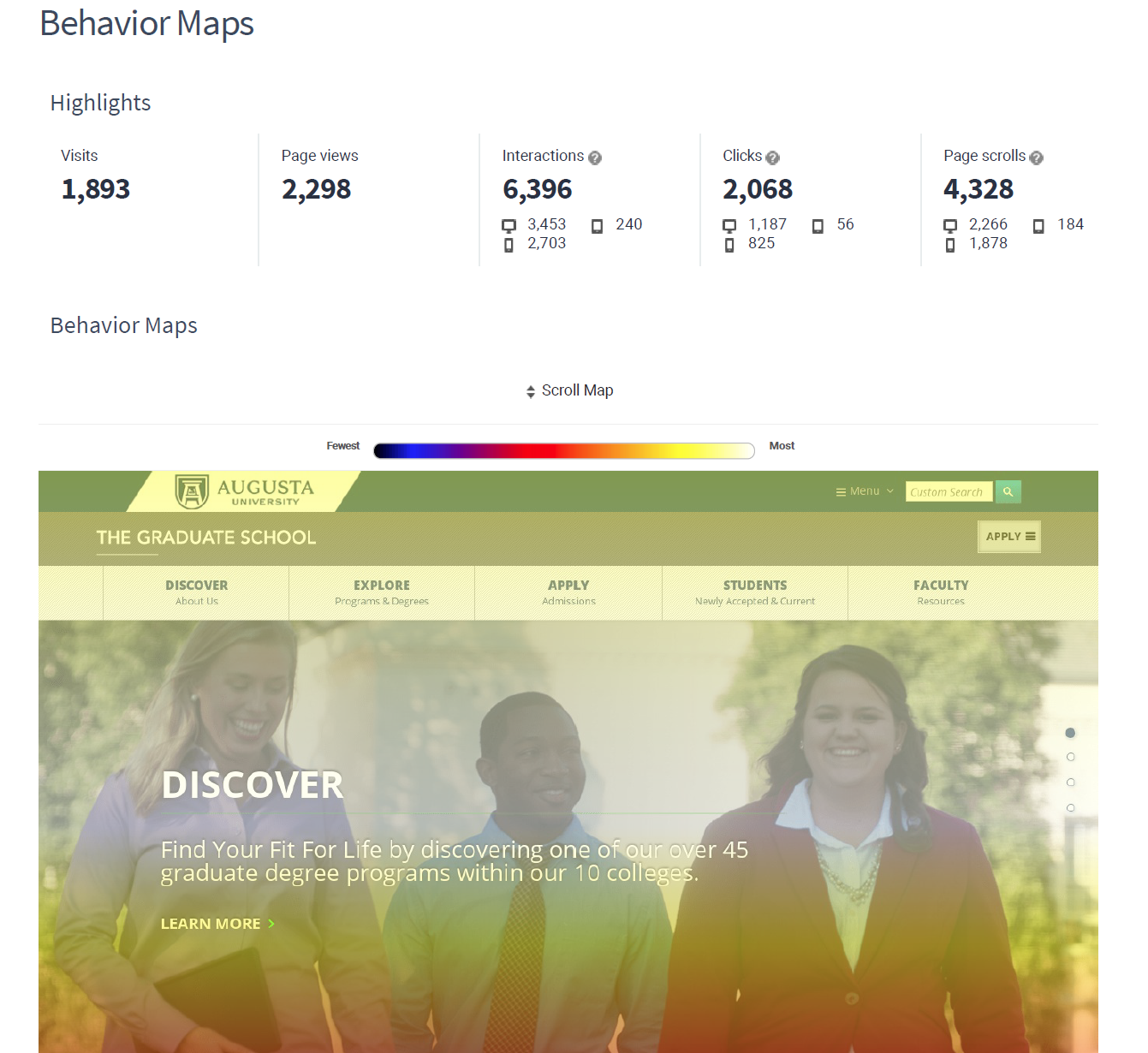
Once live, the work shifted from a one-time relaunch to a standing optimization practice. Web analytics, scroll and behavior mapping, and usability testing became a continuous diagnostic system — not a launch checklist — used to identify friction and prioritize what to redesign next. Landing pages were A/B tested (Google Optimize); the winning variant became the standard template rolled out across program pages. The same diagnostic loop was applied to the homepage, where scroll and engagement data showed visitors weren't discovering content below the fold.
Content Inventory
We created and inventory of all of our webpages.
This allowed us to identify pages that could be consolidated or discarded.
This also allowed us to identify content gaps and make a plan
Information Architecture Next, we strategized to find the best way to organize our pages to improve the navigation flow of our website. This was a big challenge for the previous website. To start we investigated and observed the navigation and order of pages on aspirational graduate school websites that we found intuitive.
This allowed us to create a closed-group sorting of navigation items. We tested this grouping amongst our office staff (7 participants) to observe how easy it was for them to located items.
After going through this process, we solidified the navigation structure. We wire-framed the organization structure that was used as a deliverable to guide the development team.
Content Gathering After the Information Architecture was established, it was my responsibility to identify outdated and missing content and gather it for the content required for the website. This required me
to collaborate with Subject Matter Experts to understand the purpose of the content and motivations for users to need this content.
Requirements Gathering and Backlog Maintenance During this phase, I managed the backlog of requirements for the project and to keep the development team on task. It was also my role to be the liaison between the stakeholders and the development team to be voice of the stakeholders and collect their feedback for changes. We completed the launch crucial requirements in 7-day sprints until we wrapped up the project.
TENSIONS NAVIGATED The persistent tension was operating inside a large bureaucratic government institution while trying to add value the structure wasn't built to accommodate — across 49 programs, each with its own stakeholders and its own view of how its information should be presented. Progress came less from authority than from building strategic partnerships across the institution, amplifying subject matter experts rather than speaking over them, showcasing the graduate experience honestly, and holding to a human-centered approach to the digital experience even where the institutional default was to organize information around the org chart rather than around the person trying to use it.
RESULTS
51% increase in unique pageviews, 9% increase in average visit length, 10% increase in site depth, and an 18% decrease in bounce rate within four months of the redesign
A/B-tested landing page template rolled out across program pages after outperforming the original design
20–30% year-over-year growth in web traffic sustained through continuous optimization
A 71% increase in graduate enrollment overall, including a geo-fenced campaign for the PhD in Biomedical Sciences program that increased applications 38% and doubled first-year enrollment two years running