
Augusta University | The Graduate School
Homepage Optimization
Year: 2018


DILEMMA
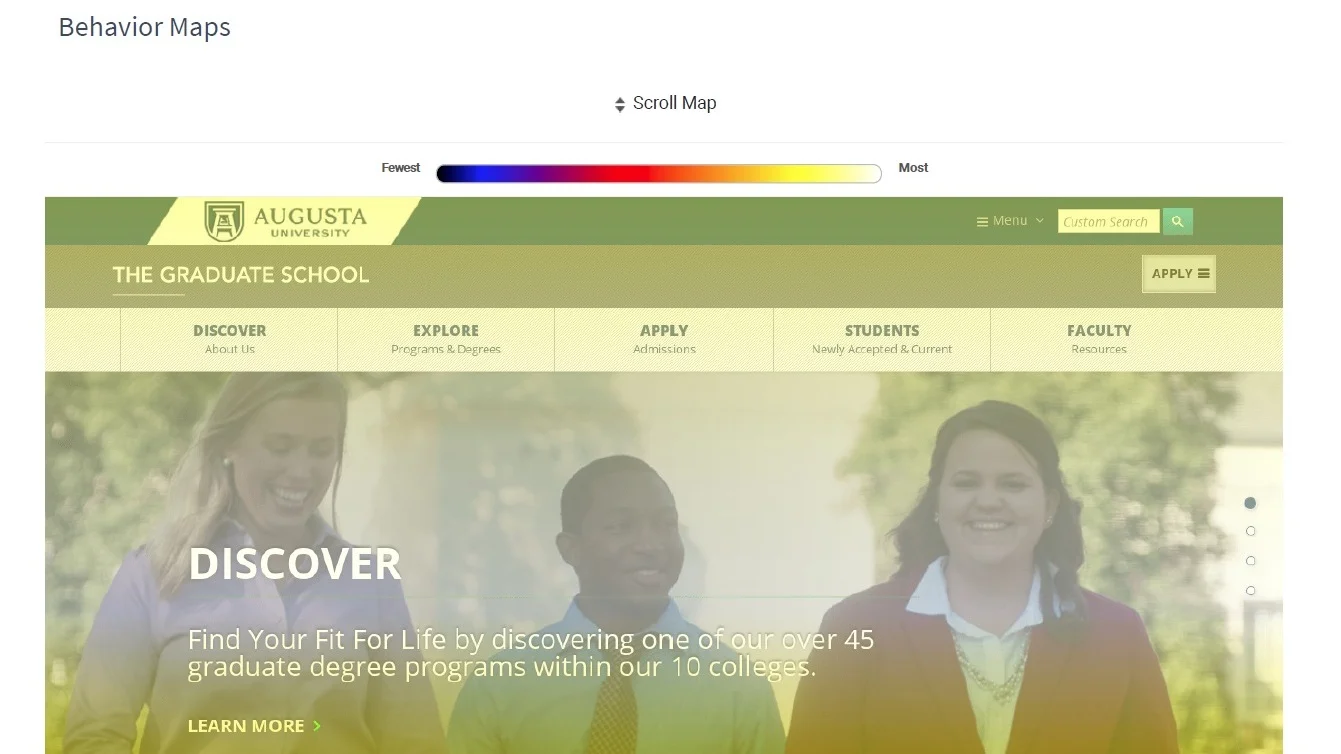
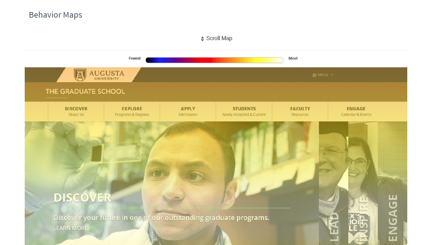
The homepage was built around what the Graduate School wanted to communicate, but engagement data told a different story about what visitors were actually receiving. Scroll and behavior mapping revealed that content below the fold was going largely undiscovered — meaning a substantial portion of what the page was designed to say was never being seen.
OBJECTIVES
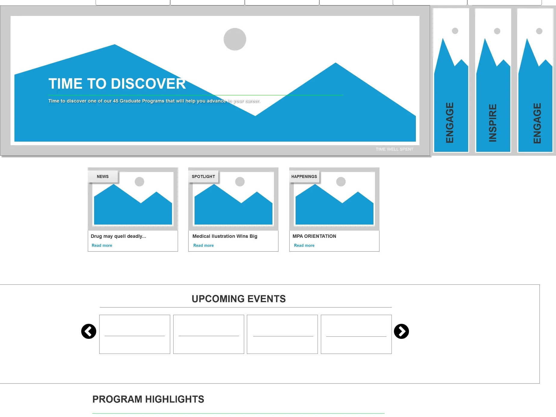
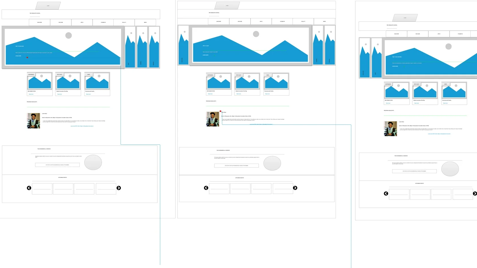
OBJECTIVE Restructure the homepage around observed visitor behavior rather than intended message hierarchy — putting what matters where people actually look.
MY ROLE Web & Behavioral Analyst | UX Designer
PROCESS
Analytics and behavior mapping were used diagnostically rather than as reporting — the question wasn't how the homepage performed but where specifically attention stopped. The drop-off pattern below the fold became a testable hypothesis about content placement rather than an assumption about visitor interest, and the redesign followed the evidence.User Research
Through the results of higher ed ad campaign case studies, student focus groups, and user interviews - we discovered that student valued hearing from the testimonials of current students. Students revealed that a big reason why they chose Augusta University was because they sensed that AU is an environment in which they can thrive and succeed with the assistance of mentors.
RESULTS
10% increase in page scroll depth — visitors reaching further into content that had previously gone unseen
Increased engagement through the top-page headline carousel, measured by click-through
Confirmation that the problem was placement rather than interest: the content wasn't failing to compel, it was failing to be encountered